Well, the earth shook a little and in celebration of Memorial Day, we have posted a new version of our www.digitalanarchy.com website. It’s only been two years in planning; the challenges of a small company. Here is a fun design exercise that I would like to share.
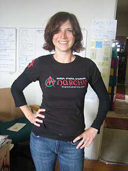
I had the opportunity to design all of the banner graphics for our website. For the non-product sections, I wanted to have a little fun, so I conceptualized the Support Section banner by starting with two images. One is a banner graphic that I’ve always liked for the website www.inhouseticketing.com, which is a company that services tickets for many fun events in the Bay Area. The other is a photo a friend wearing her kool kid Digital Anarchy t-shirts after a bike ride.
I talked through the concept with our production artist, and between the two of us, we came up with this initial design:
Which is okay as a rough but a bit unrefined. The t-shirt photo is washed out because it was a quick shot under poor lighting conditions. The vector art is nice enough but too derivative for me to feel comfortable using. Back to the drawing board…
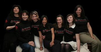
What I really liked about this piece was the idea of cute girls wearing our Digital Anarchy t-shirts. So I decided to get a group of ladies together. The result was this, a gathering of lovelies at an arts foundation that I volunteer with. The ladies were invited to keep their t-shirts, which begs a standard ‘all I got’ joke, but we’ll ignore the obvious and move along…
Once in Photoshop, I realized very quickly that I should have been more organized in setting up this photo. If I had brought a blue screen with me, I could have set up the shot for super-easy masking with our chromakey removal tool, Primatte Chromakey. Instead, I wound up doing some painful background removal surgery with Photoshop’s built-in tools. Ah well. After some pixel niggling, the gals are against a black background and ready for compositing into our Support banner.
The website banner is only 70 px high, which meant the head height of the girls was too spread out. That issue was fixed easily in Photoshop, with the result being:
This composition felt lopsided, so I added in another photo of two Anarchist gals, plus a t-shirt image surrounding the text ‘Support Center’ to spice up the left side.
And…we’re done. And launched. Finally! Let me know if you find anything that doesn’t work for you on our site.
regards -Debbie


